You love a deep navy kitchen. You also love warm white oak. Your partner wants all white. Choosing one finish for an entire kitchen can feel like picking a favourite child, and that’s exactly why two-tone kitchen cabinets have become one of the most requested looks in our showrooms.
Done well, two tones give a kitchen depth and personality without feeling busy. Done without a plan, they can look like two kitchens that met by accident. Here’s how our designers get it right.
Why Two-Tone Kitchen Cabinets Work
A second finish gives the eye somewhere to land. It can make an island feel like a piece of furniture, ground a tall wall of cabinets, or bring warmth into a mostly white room. It also lets you try a bold colour in a smaller dose, so you can still love it in ten years.
Three Pairings That Never Miss
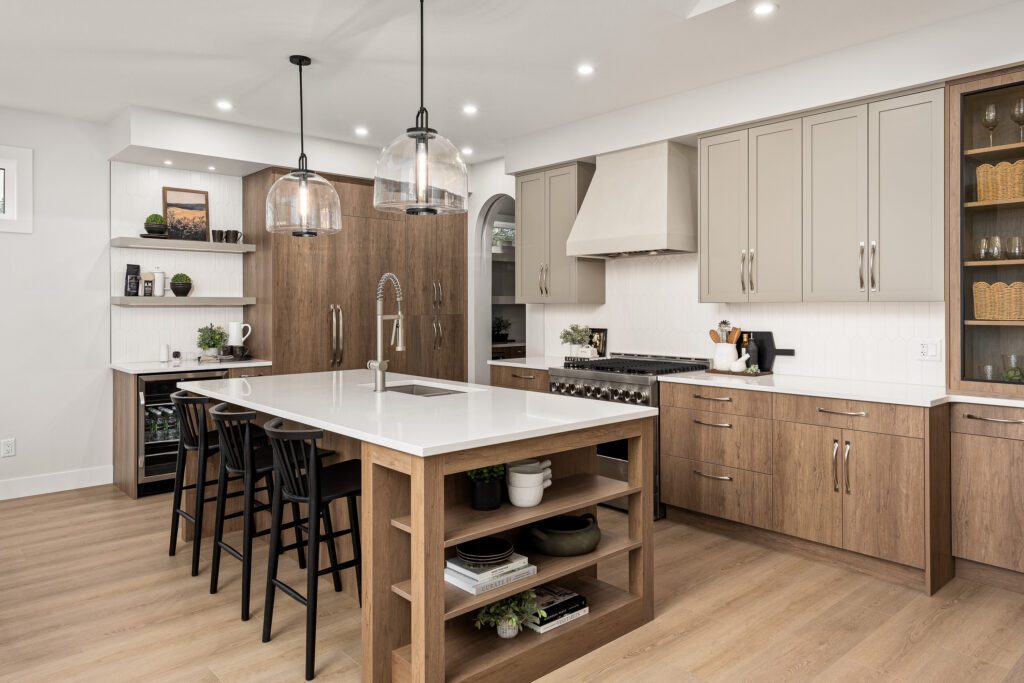
Painted perimeter, wood island
This is the classic. A light painted perimeter keeps the room bright, and a wood island adds warmth right where people gather. Our award-winning Entertainer’s Dream kitchen pairs white lacquer uppers and lowers with a rift cut white oak island and tall towers.
Light uppers, deep colour below
Darker cabinets sit low and feel grounded, while lighter uppers keep the room open. In Shorerise by Dilworth Homes, designer Kati Knorr used Night Sky Blue lacquer on the island, bar and fridge wall, with Vanilla Milkshake uppers and a matching custom hood.
Rich wood with a painted accent
Flip the classic. Let wood carry the main run of cabinets and use paint for the island or uppers. Sailview Bay, designed by Christine Caracciolo, pairs a Tabacco-stained rift cut white oak with River Reflections lacquer on the uppers and island.
Where to Put Each Tone
The rule of thumb: darker and heavier tones go low, lighter tones go high. That keeps the kitchen from feeling top-heavy. A few placements that work:
- The island: the easiest place to start. It stands on its own, so a second colour reads as intentional.
- Tall towers: a pantry or fridge wall in a contrasting finish frames the kitchen nicely.
- Lowers vs. uppers: dark lowers with light uppers suit smaller kitchens that need to stay bright.
- A bar or coffee station: a contained spot to try a colour you’re not ready to commit to everywhere.
Avoid splitting tones in random spots. Each finish should have a clear job.
Tie the Two Tones Together
Two-tone kitchen cabinets look most polished when something connects them:
- Use the same door style on both finishes.
- Keep hardware consistent across the whole kitchen.
- Repeat each tone at least once somewhere else, like floating shelves, a hood or bar stools.
- Choose countertops and a backsplash that sit comfortably with both colours.
The Hewetson kitchen by Christine Caracciolo is a good example. Fawn Brindle cabinets and floating shelves share the room with a Salt of the Earth island, and the same shaker profile carries through both.
Choosing Your Series
Two-tone kitchens can work across several Westwood series. Elements offers 31 finish options, including woodgrains, for a curated two-tone look. Elite adds painted finishes. Custom gives you painted, stained and lacquered finishes in any combination, with custom colours if you want an exact match.
Compare them on our Browse by Series page.
Designer Tip: Look at your two samples side by side, then stand back three metres. Tones that look different up close can blend together from across the room. You want enough contrast that the choice reads as deliberate.
Find Your Perfect Pairing
The best way to choose two finishes is to see them together, under your own light, with your countertop sample in hand. Visit our Kelowna showroom or book a free consultation, and our designers will help you build a combination you’ll love for years.